Problem
Determining the issue or areas that need improvement.
Process
The plan to mitigate the problem and work towards the solution.
Solution
The implemented plan to improve the users' experience.
Results
The final outcome that has been checked, tested, and proven successful.
2023
A league for cities and towns full of news, updates, resources, and information.
Role
Website Designer, UX/UI, Wireframing, Project Management, Website Trainer
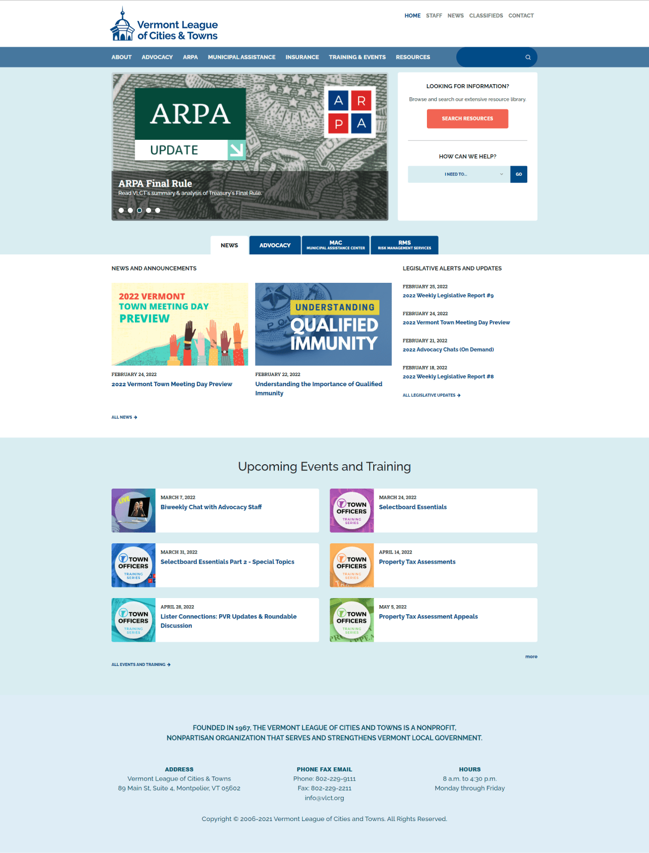
Old Design

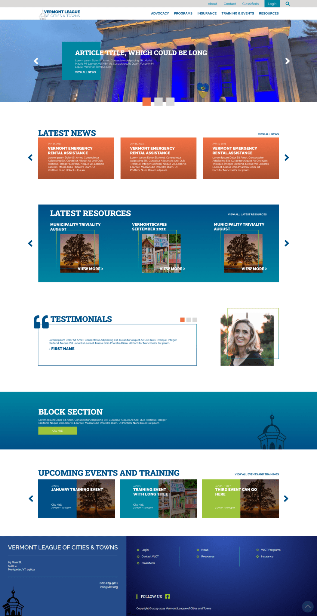
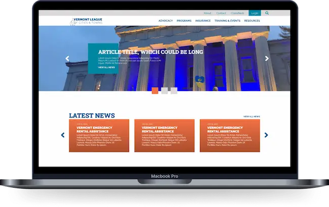
New Design

Case Study:
Vermont League of Towns & Cities
Problem
Outdated design and platform. The website's overall appearance has become dated and the user's experience has become a struggle for navigating and finding information and resources.
Process
We set up internal and external surveys for both the client and users of the platform to assist with thoughts, issues, and struggles. After aggregating results, we review analytics and devise a plan to help mitigate issues for users and help them navigate quickly and efficiently.
As part of redesigning an outdated website, we review content locations and navigational structure as part of our wireframing process. Once this information is collected and wireframes are completed, the mockup is created via Figma. We collect any branding assets and imagery available from the client and add these in for consideration and to help the design process.
First is the homepage, built with mobile in mind, which is sent back to the client for review. After revisions or changes from the client were finished, we moved forward with interior pages utilizing component-based formatting for reusable blocks and styles to implement throughout the website.
Content migration follows with another round of user review to ensure all pages and content have been transferred correctly and funneled into their respective location, detailed from the previous navigational review earlier in the project.
For this project, I trained a group of users on how to create content and make changes and empowered them to make the website their own.
Within two weeks of training, after the new users could access the website and adapt pages as needed, it was launched to the world.
Solution
Freshly designed website with updated branding, user flows, and structure for easy navigation to desired content with the fewest clicks possible.
Results
It has increased average monthly users by nearly 2000.

Reflection
This process has worked well for the redesigned website. The back-and-forth with the client on this one smoothed out a few potential pain points since they wanted to be more hands-on with the designs and feel of the website than some leagues or municipalities I’ve worked with. It opened up additional possibilities and outcomes, which resulted in a very functional and user-friendly website.